Next to the lumens, the box of a light always shows a number in kelvin (K) as well: 2700 K, 3000 K, 4000 K or 6500 K. It gives the colour of the light, that is, whether the white light is a warm, yellowish white or a cool, bluish one. Choose wrongly, and your living room will feel like an office and you’ll look pale in the bathroom mirror.
This article shows the kelvin scale in pictures and gives the right light colour for each room. It also explains what the box doesn’t tell you: why two “3000 K” bulbs can still be different colours, and why you should check colour rendering (CRI) as well as colour temperature.
Which colour temperature for which room?
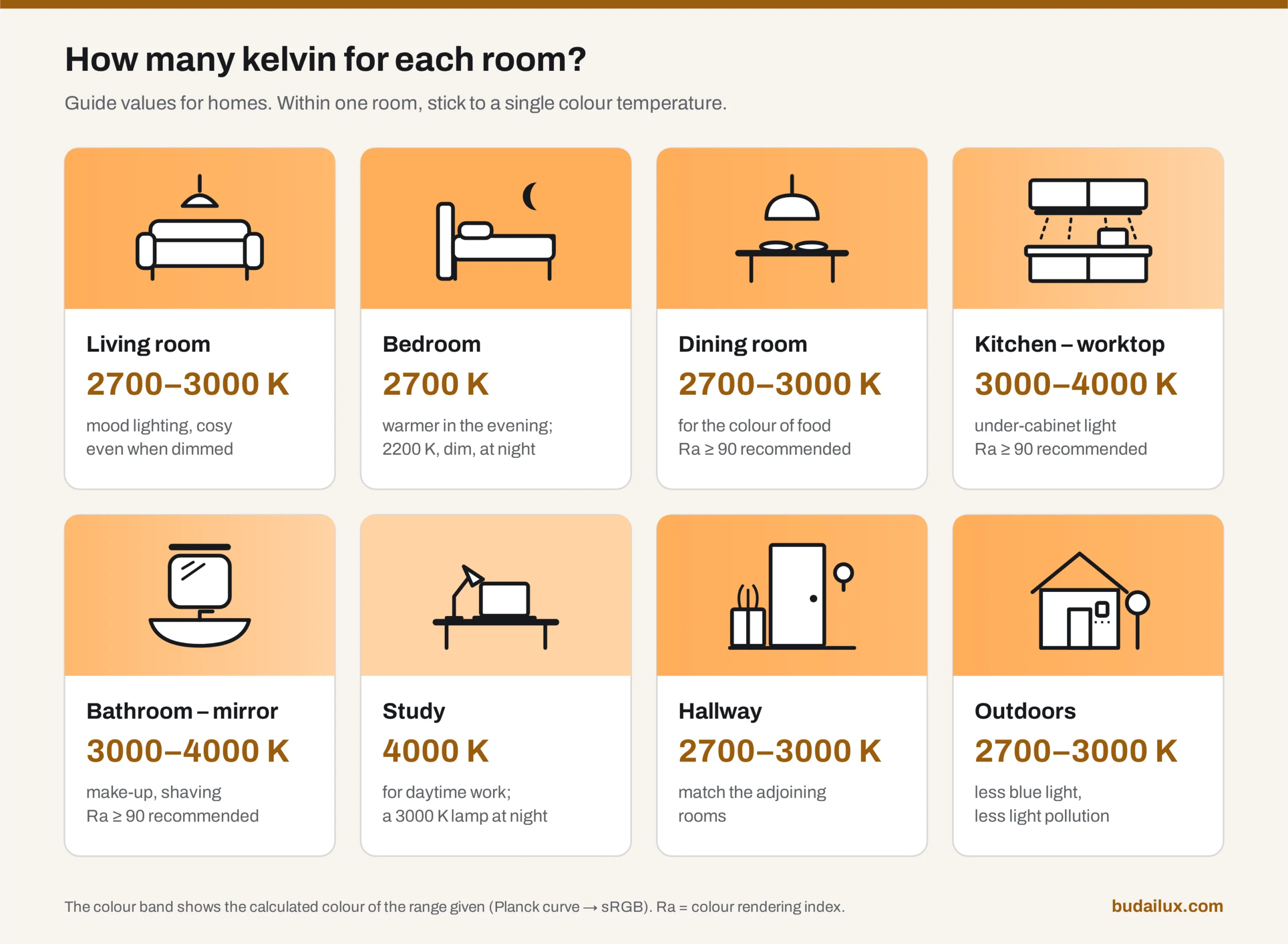
In a home, 2700–3000 K (warm white) suits most places: the living room, bedroom, dining room and hallway. For kitchen worktops and bathroom mirrors, 3000–4000 K is recommended, and for a study, 4000 K. Cool white at 5000–6500 K is rarely justified at home, because it feels harsh in the evening.
| Room | Colour temperature | Colour rendering | What to watch |
|---|---|---|---|
| Living room | 2700–3000 K | Ra ≥ 80 | With a dimmable or dim-to-warm light source, it also works as evening mood lighting. |
| Bedroom | 2700 K | Ra ≥ 80 | In the evening, warmer and dimmer light is better. For a night light, 2200 K or warmer, at low brightness. |
| Dining room | 2700–3000 K | Ra ≥ 90 | High colour rendering makes food and table settings look natural. |
| Kitchen – worktop | 3000–4000 K | Ra ≥ 90 | If the kitchen shares a space with the living room, stay at 3000 K so that the light in the two areas doesn’t clash. |
| Bathroom – mirror | 3000–4000 K | Ra ≥ 90 | For make-up and shaving. Check the IP rating too. |
| Study | 4000 K | Ra ≥ 80 (≥ 90 for colour work) | For daytime work. In the evening, a 3000 K desk lamp is more pleasant. |
| Hallway | 2700–3000 K | Ra ≥ 80 | Match it to the rooms that open off it, so there’s no jump in colour. |
| Children’s room | 2700–3000 K | Ra ≥ 80 | For a night light, a very dim amber light is enough. |
| Outdoors (façade, garden) | 2700–3000 K | Ra ≥ 80 | Warmer light has less blue in it and causes less light pollution. |
Graphic: BudaiLux
What does kelvin mean, and why is a lower number warmer?
The kelvin is the unit of temperature, and for the colour of light it literally means temperature. If you heat a black body (the ideal body of physics, which absorbs all radiation), it starts to glow: first red, then orange and yellowish white, then whiter and more and more bluish. Each temperature has a characteristic light colour, and on a chromaticity diagram these form the Planck curve (Planckian locus).
An LED doesn’t produce light from heat, so its box gives the correlated colour temperature (CCT): the temperature of the black body whose colour most closely resembles the colour of the LED’s light. The EU Ecodesign Regulation, 2019/2020, defines it the same way, and requires it on the packaging, rounded to the nearest 100 K, as a number and also as a graphic or in words.
The terms “warm” and “cool” don’t come from physics but from mood: we associate orange light with fire and sunsets, and bluish light with a cold, overcast day. That’s why the relationship is reversed: the light of a physically hotter black body is the “cooler” one. The lower the kelvin number, the yellower and warmer the light.
Graphic: BudaiLux, own calculation
What do 2200, 2700, 3000, 4000 and 6500 K look like?
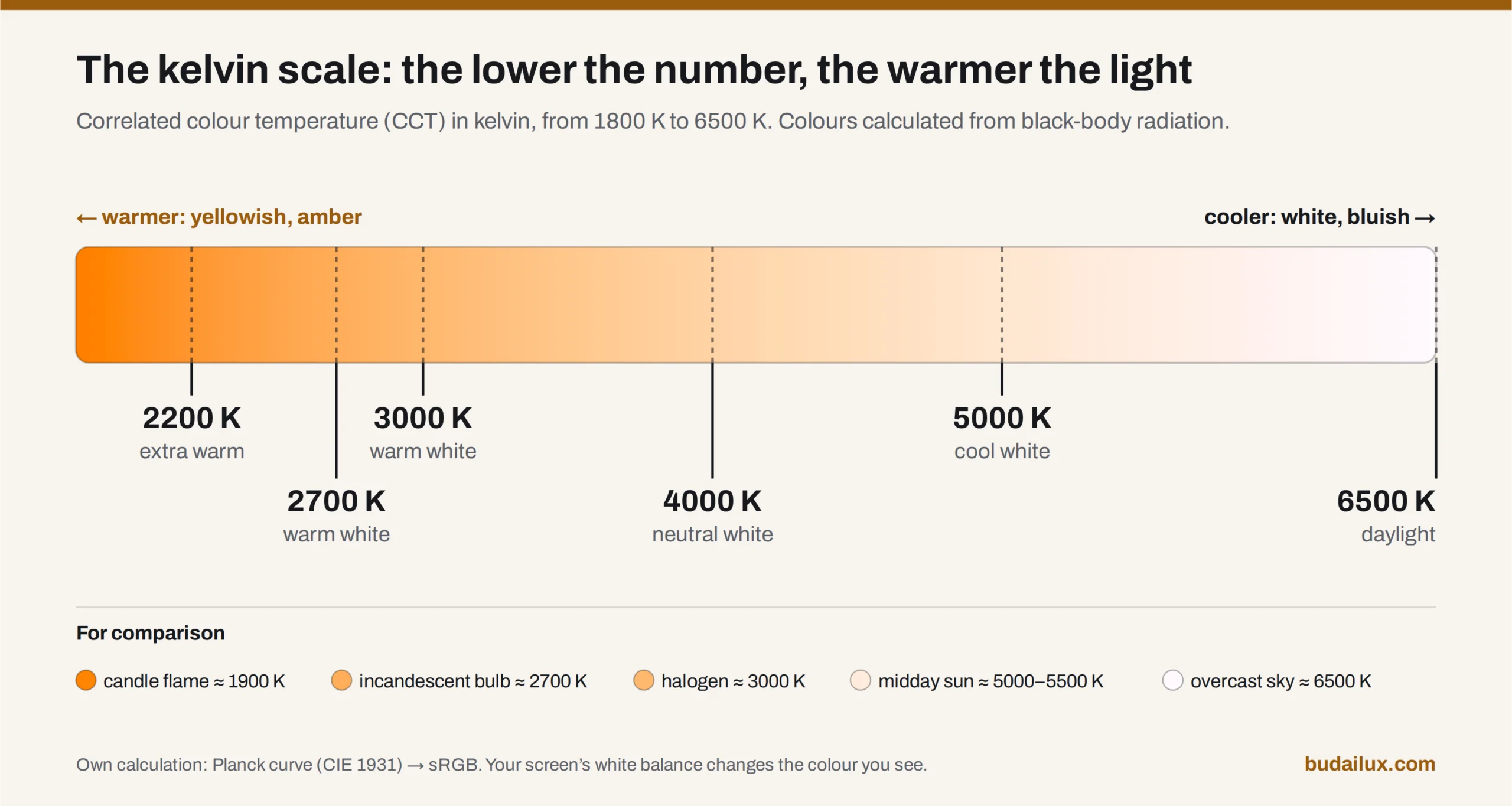
- 2200 K – extra warm, amber. Between a candle flame (about 1900 K) and a traditional incandescent bulb. Common in decorative “filament” bulbs. Not suitable as task lighting, but excellent for evening mood lighting and as a night light.
- 2700 K – warm white. The colour of a traditional incandescent bulb, and at home usually the right choice.
- 3000 K – warm white, a shade fresher. Close to the colour of a halogen bulb. In kitchens and bathrooms, a good compromise between atmosphere and task lighting.
- 4000 K – neutral white. Neither yellowish nor bluish. The norm in offices and schools; at home it belongs at workspaces.
- 5000–6500 K – cool white, daylight. Midday sunlight is about 5000–5500 K, an overcast sky about 6500 K. It suits garages, workshops and storerooms, but rarely living spaces.
“Warm white”, “neutral white” and “cool white” are not categories defined in law. In professional usage, light below about 3300 K is called warm white, 3300 to 5000 K neutral, and anything above that cool or daylight white (some sources put the upper limit at 5300 K). So when buying, always look at the number, not the name.
You can try out the difference with a slider in the light colour simulator below. The same tool is also among our calculators.
Light colour simulator
Luminous flux is the quantity, colour temperature is the quality. The same 3,000 lumens feel homely at 2,700 kelvin and harsh at 6,500 — and this is the biggest uncertainty when buying, because you can rarely compare them in a shop.
The scale, point by point
| Kelvin | Name | Where it belongs |
|---|---|---|
| 2200 K | Candlelight | Very warm, amber. A restaurant or bar atmosphere. Too dim for reading, but excellent as evening mood lighting. |
| 2700 K | Warm white | The colour of the classic incandescent bulb. Living room, bedroom, dining room — at home this is most often the right choice. |
| 3000 K | Warm | A shade crisper, but still homely. Kitchen, bathroom, children's room. |
| 4000 K | Neutral white | Study, workshop, garage. In a living room it feels cold, and it can be jarring in the evening. |
| 5000 K | Cool white | Industrial and commercial spaces. Almost never justified in living spaces. |
| 6500 K | Daylight | The colour of the midday sky. Not for home use: harsh, and in the evening it makes it much harder to fall asleep. |
What this simulation shows, and what it doesn’t: it conveys the difference faithfully, but it is not a colour-accurate measurement — your screen’s own white balance plays a part too. Before buying, look for the kelvin value on the packaging, and use the same one throughout a room where you can: two different colour temperatures in one space are more jarring than either on its own.
Why is 6500 K too harsh for a home?
6500 K is the colour of an overcast sky. In the daytime, with plenty of light, it looks natural, but at home in the evening we use far less light, and in a dimly lit living room cool white looks grey, bleak and clinical to most people. On top of that, cooler light contains more of the short-wavelength blue component, which is the least desirable in the evening.
It belongs in a garage, workshop or storeroom, where the light is needed for work and you don’t spend long evenings.
Does the colour of light in the evening affect sleep?
It can, but the amount of light matters at least as much as its colour. According to a 2022 international expert recommendation, many ordinary home 2700–3000 K warm white LEDs already meet the evening limit at a moderate lighting level of about 30 lux.
Our eyes contain a type of light-sensitive cell (the melanopsin-containing ganglion cells) that is needed not so much for seeing as for setting our internal body clock, and it is most sensitive to bluish, short-wavelength light. That is why the recommendation published by Brown and colleagues in the journal PLOS Biology in 2022 sets its limits not in kelvin but in the amount of light acting on this cell type (melanopic EDI): from at least three hours before bedtime, no more than 10 lux at eye level, and no more than 1 lux while sleeping. During the day, on the other hand, it recommends at least 250 lux.
In practice: in the evening, use warm white light at 2700 K or warmer, and switch off the lights you don’t need. In the bedroom, a dim amber light is enough at night. In the daytime, though, plenty of light — even cooler light — does no harm and is actually beneficial. This is general lighting advice, not medical advice; if you have persistent sleep problems, see a doctor.
What is the difference between dim-to-warm and tuneable white lights?
A dim-to-warm light gets warmer by itself as you dim it, for example from 2700–3000 K towards 1800–2200 K, just like an old incandescent bulb. With a tuneable white (CCT-adjustable) light, you set the colour temperature independently of the brightness, typically between 2700 and 6500 K.
A traditional bulb got yellower when dimmed because its filament cooled down. A plain LED stays the same colour when dimmed, so at low brightness it can look greyish. Dim-to-warm makes up for this, and it works with a conventional dimmer, without an app. Ideal for living rooms, dining rooms and bedrooms.
Tuneable white needs two LED channels (warm and cool) and a controller: a remote control, a wall control or a smart home app. It is useful where the same space serves for work during the day and for relaxing in the evening: a study, a kitchen or an open-plan living room. With simpler two-channel products, the in-between shades can be slightly pinkish, because a mix of two whites doesn’t fall exactly on the Planck curve. It’s worth seeing this in person before you buy.
The EU Ecodesign Regulation does not count either type as a colour-tuneable light source (such as RGB). For tuneable white, the packaging has to show the range of colour temperatures that can be set.
Why are two “3000 K” LEDs different colours?
Because the kelvin value only tells you which point of the Planck curve the light is closest to, not whether it lies exactly on it. Of two 3000 K LEDs, one can be slightly greenish and the other slightly pinkish, and if they end up side by side, you’ll notice.
The deviation is given in MacAdam steps; on the box it often appears as SDCM (standard deviation of colour matching). Each step is a small ellipse on the chromaticity diagram around the nominal colour: the fewer the steps, the more uniform the colour of units of the same type. As an industry rule of thumb, a 1-step difference can’t be seen even side by side, at 2–4 steps a careful eye can notice it, and above 5 steps it is usually obvious when the lights are fitted side by side.
Since 1 September 2021, the Ecodesign Regulation (EU) 2019/2020 has required the chromaticity coordinates of LED light sources to stay within a six-step MacAdam ellipse of the centre point declared by the manufacturer. That is the legal minimum. Where several lights are seen side by side (a row of spotlights, an LED strip, mirror lighting), it’s worth looking for 3 steps or fewer. The number of steps is also on the product’s EPREL record, which the QR code on the energy label leads to.
For one room, buy light sources from the same series at the same time, and when replacing one, look for the exact type.
Is kelvin enough, or does colour rendering (CRI) matter too?
Colour temperature is about the colour of the light; colour rendering is about how true the colours of the lit objects look. The two are independent of each other: a 2700 K LED can have excellent or poor colour rendering.
The colour rendering index (CRI, symbol Ra) can be at most 100, the value of a reference light of the same colour temperature. The EU regulation requires at least Ra 80 for most light sources, and the value has to be shown on the packaging, rounded to a whole number. For kitchens, dining areas, bathroom mirrors and make-up, Ra ≥ 90 is recommended, because the colour of meat, vegetables, skin and make-up depends on it.
Ra is the average of eight mostly pastel test colours and doesn’t include saturated red (R9), even though skin tones and the colour of food depend a lot on it. The R9 value is also on the product’s EPREL record. Our crystal chandelier guide lists colour rendering, alongside colour temperature, among the details worth asking the seller for.
Can one room have two different colour temperatures?
It can, but it’s rarely a good idea. The eye always adapts to the dominant white around it: if 2700 K and 4000 K are mixed in one space, one light looks orange and the other bluish and cold, and the space falls apart. The same happens in an open-plan home if the kitchen is 4000 K and the living room 2700 K.
- One room, one colour temperature. The ceiling light, the spotlights and the wall lights should all give the same light.
- Neighbouring values in spaces that open into each other. 2700 and 3000 K still sit well side by side; 2700 and 4000 K don’t.
- Exceptions on purpose. A warmer table lamp or picture light can differ if you mean it as an accent.
What should you check on the box before buying?
- Colour temperature (K): as in the table above.
- Luminous flux (lm): the amount of light is given by the lumens, not the watts. Our lumen guide helps with this.
- Colour rendering (Ra): at least 80; 90 for kitchens and bathrooms.
- Colour consistency (SDCM): 3 or fewer for lights placed side by side.
- Base: our guide to bulb bases helps you identify which one fits your lamp.
How was the scale graphic made? The colours weren’t picked by eye. We converted points of the Planck curve (using the approximation formula of Kim and colleagues) from the CIE 1931 colour space to sRGB, adjusted to the standard white point of monitors (D65). Your screen’s white balance and brightness will still affect what you see, so when buying, go by the number on the box, and for lights placed side by side, by the MacAdam value.
Frequently asked questions
How many kelvin is warm white?
Warm white is usually 2700–3000 K. A 2700 K light source is generally called warm white, a 3000 K one sometimes “soft” or “warm” white, and 2200 K amber light extra warm. The names are not standardised, so always look at the kelvin number.
How many kelvin is cool white?
It usually starts above 5000 K, and 6500 K light is often called daylight. 4000 K neutral white is not cool white, although next to a 2700 K lamp it can look like it.
Do I need 3000 K or 4000 K in the kitchen?
Both are fine for the worktop. If the kitchen is a separate room and you do a lot of work in it, 4000 K feels fresher and livelier. If it shares a space with the living room or dining room, 3000 K is better, so that the light in the two areas doesn’t clash. Either way, look for a light source of at least Ra 90.
What does the SDCM or MacAdam value on the box mean?
It tells you by how many steps, at most, the light colour of units of the same type may deviate from the nominal colour. In the EU, at most 6 steps are allowed for LED light sources; for lights fitted side by side, 3 or fewer is recommended.
Sources
- Commission Regulation (EU) 2019/2020 laying down ecodesign requirements for light sources and separate control gears pursuant to Directive 2009/125/EC. EUR-Lex, English text. Annex I: definitions of correlated colour temperature and colour consistency; Annex II, point 2, Table 4: Ra ≥ 80 and a six-step MacAdam ellipse at most; Annex II, point 3: details required on the packaging.
- Commission Delegated Regulation (EU) 2019/2015 supplementing Regulation (EU) 2017/1369 with regard to energy labelling of light sources. EUR-Lex, English text. Content of the product information sheet (EPREL), including the R9 value and colour consistency in MacAdam ellipses.
- CIE (International Commission on Illumination): International Lighting Vocabulary, CIE S 017:2020, 17-23-068 “correlated colour temperature”. CIE e-ILV.
- Brown, T. M. et al. (2022): Recommendations for daytime, evening, and nighttime indoor light exposure to best support physiology, sleep, and wakefulness in healthy adults. PLOS Biology 20(3): e3001571. doi.org/10.1371/journal.pbio.3001571